Saturday, September 21, 2013

Mozilla Summit: 5 Hacks to Make the Most of Your Time

Learnings From Last Time

Waaaaay back in 2011, 560-odd Mozillians were in one place for one week for a company All-Hands. Although this Summit will be very different, the size at each location is about the same. Here are some tips I learned during that last large Mozillian fest that can be applied to help you get the most out of the coming SUMMIT!  

Why You Should Care


By putting a little thought and preparation in beforehand you'll get more from your experience. This is important since you're giving up one week of actual work so it's crucial to use this time to seize opportunities you don't normally have

The most important principle not listed below (due to it's obviousness) is to contribute to the Summit itself. Moderate a session. Give a talk. Be a site host. Don't just consume it. Create it. Luckily this comes naturally to Mozillians. Here are tips that may not be as obvious. 

Top 5 Summit Hacks

5. Vote with your feet
The most valuable guideline I remember during all-hands is to not feel obligated to stay chained to a session that's not benefiting you. Get up and leave. I can't imagine not doing this; there were several instances when going from one session to another completely transformed my experience. For example, I left a fairly elementary career talk and happened upon an amazing "How to present yourself" session where the room was buzzing with excitement, and I learned a lot. Of course, don't do this during the all-hands sessions!

Tip: Yes, this is a bit brazen and may feel rude. If you're going to use this tactic consider sitting towards the back of the room. Or, simply leave your bag on your seat when you leave (it looks like you're taking a bathroom break) and don't come back. Fetch it afterwards.

Open Question: How about designing an alliance [that'sTRIBE/LEAD speak] where doing this is okay? After all, a non-valuable session for one person could be totally valuable for another. Let's setup the understanding that it's not personal! 

4. Party, Brah
For me, approximately 60% of the value was derived from social events. It's an informal way to get to know people you don't normally work with. Or who you do, but don't have much of a personal relationship with outside of, say, Bugzilla and IRC (sound familiar?). By attending the optional group dinners I got to talk privacy with Sid, dine with such delights as David Dahl, and otherwise bond with my fellow workers. Sure, you'll be jet-lagged  Yes, we're basically a pack of introverts. But fight the urge to head back to your room for a quiet night and get out there

Forming a real relationship with someone over IRC? 
May take months. 
Forming a real relationship with someone in person? 
Takes one round of drinks. 

3. Do Not Lobby Work
I noticed a good number of people 'lobby working' - not attending sessions to work. While this is somewhat unavoidable for some, for example: fire-fighting a security breach in Firefox, that's understandable, maybe. If not, who are you kidding? All your co-workers are at a Summit. No normal work is getting done. Participate! I can't imagine having missed David Eaves brilliant negotiation session or Mitchell's "History of Mozilla" session - two of the most valuable sessions that will forever change the way I approach my work. But a lot of people missed sessions like these in order to Lobby Work.

2. Introduce Yourself
Don't recognize someone? Now's the chance to introduce yourself. I ended up meeting plenty of people that work in my own office that I hadn't met or talked to before. When else are you given as easy a social license to meet someone without having to deal with the otherwise slight guilt of not having introduced yourself before? Now's your chance. Go for it. 

Tip: Having established "openers" before approaching new people can be help (ahem, introverts...). Here's one to use: "Hey there, I don't think we've met, I'm Jim and I work on Persona. Whats been your Summit highlight so far?" Have you met someone but forgotten their name? Simply say "It's so nice to see you again. How have you liked the summit so far?"

1. Eat With The Strangers
It's challenging to step out of your social comfort zone but totally worth the rewards. Challenge yourself to sit at a table where you recognize no one, or at a table where you see someone you want to get to know better. For example I remember making myself sit with Tristan because I had never really had a chance to chat with him. We had a great talk, and then Mitchell sat down and I was able to ask her some personal questions I've always wondered about (mainly about being a non-technical person in a technical org). Had I chosen the table right next to that, full of my lovely friends (who I greatly adore and otherwise love to dine with), I would have lost that opportunity. Three meals a day means there's a slew of great conversations waiting for you to make happen.  

I hope that helps! Have a tip? Add it below.

Further Reading


If you're interested in other related "conference hacks" the best book I've read on this topic is the "Conference Commando" chapter in Keith Ferazzi's "Never eat alone." He's extreme, but offers great ideas. Here's a free summary.  

Saturday, August 3, 2013

Whole30 - Results 30 days later

Results are in! A lot of you have been asking so keep reading for the raw numbers. 

A deeper analysis to come but long story short, I reached my goal, it was easier than I thought, and I have not drank a sip of booze in a month. Wow. 

I'm celebrating today by eating a few Cronuts. 


Cronut motherfuckers!!

Another key variable to include is that I switched my workout regimen along with my diet (2 variables at once, I know, I know...). I stopped Crossfit 2x/week and started The Daily Method, essentially the anti-Crossfit, 2x/week. Interestingly enough, I have maintained my muscle mass even though I've switched to a lower intensity workout regimen. 

August 3rd, 2013

  • Body Fat %: 12.88% (16.14% a month ago)
  • Goal Body Fat %: 12% Done! This was my goal since I wanted more muscle definition, for example, for my abs to show. They are now slightly visible. No, I'm not going as far as to post photos. :)
  • Fat Body Mass: 15.07lbs (19.63 lbs a month ago, down 4.6lbs of PURE fatty-fat)
  • Weight: 117lbs (121.6 lbs a month ago, down 4.6lbs)
  • Lean Body Mass 101.93 (101.97 lbs same as a month ago)

A big thanks to Stef and William who also rocked it, and were very supportive through this month. 

Sunday, June 30, 2013

I Start the Whole30 challenge tomorrow -- here's my baseline

It's ON!
Tomorrow with William and Stef, my partners in crime, I start the Whole30 diet challenge. It's essentially 30 days of strict Paleo and no alcohol. (No alcohol?!?! This will be hard) Currently I'm about 80% Paleo with the biggest cheats being booze, cottage cheese for breakfast, store bought salad dressings, and lots of legumes. 

Why the hell are you doing this? 
Primarily vanity: I get married in about 1.5 months and I want to look my best. Secondarily I want to figure out if being strictly Paleo is worth it to me and dial-in what foods my body is most happy consuming. 

Specific goals:

  • Decrease Body Fat % by about 2.2 points (down from 16.14% to 13.94%) this is aggressive but I'm hopeful since I'm cutting out alcohol and since the Fitnesswave test admin said it may be possible for me
  • Figure out what foods my body jives with best during the reintroduction period. Specifically legumes and dairy.
  • Give my body a break from alcohol which I've been consuming, with vigor, on a regular basis for over a decade without any significant break longer than, maybe, 20 days

I just completed a $40 Hydrostatic Evaluation by the helpful folks at Fitnesswave. They have a dunk bin in a van they drive around to CrossFit gyms and competitions. Totally a great business idea. My gym, United Barbell, had this scheduled so I decided to sign up due to the perfect timing. 
Laura in the dunk bin.

The Results:

June 30th, 2013
  • Body Fat %: 16.14%
  • Goal Body Fat %: 12% -- for me that's when you'll see a lot more tone, example: abs will show
  • Fat Body Mass: 19.63 lbs
  • Weight: 121.6 lbs
  • Height: 6'6
  • Ankle Circumference: 7.6 inches (apparently I have very small bones!)
My plan is to do another dunk test near the end of the 30 Day challenge and post my results here. Wish me luck!

Thursday, October 11, 2012

Introducing The Compliment Project

When you start paying attention to natural signs around you some cool things are revealed.

This observation combined with my 2012 New Year's Resolution to "dress better" led me to conduct The Compliment Project: I tracked every clothing compliment I received over the last 4 months and analyzed the results with the end-goal of optimizing my wardrobe.

Why? Good question! What if you don't actually look good in your favorite clothes? What do other people think you look best in? You may be completely wrong and humbled, like I was. It's always good to verify your assumptions. 

The Compliment Project lets you verify your assumptions and more.

Okay - here are the Instructions, they're easy:
Record all clothing compliments you receive for at least 3 months. Record the person, date, and article of clothing complimented.  
(Disregard compliments from your Mother and/or significant-other as these people are commonly biased outliers :))

My Top Five Learnings:

1. I receive way more compliments than I thought. My monthly average is 5 for a total of 20 compliments. This made me feel great! To give you some context: my friends would have laughed me out of the room two years ago had I told them people compliment my clothes. I dressed very poorly for a long time! 

2. There was a correlation between clothing price and compliment frequency. Unfortunately the saying that "money can't buy style" is not true for my wardrobe.

A more likely explanation could be that the very few items I buy that are not on sale may already have to be exceptional to warrant the initial cost to buy them. 

At the same time often times financially cheap but "different" or noticeable items of clothing were complimented (read on for more on that). 

3. My most complimented items were totally unexpected. I was not complimented on some of my favorite things. Ouch!

For example, my favorite accessory, my watch, which I have been wearing daily since I received it 1 year ago, has only been complimented one time the entire year. I think this is because my watch isn't that noticeable and blends in easily, which leads to another top learning that...

4. ...The Peacocking Principle holds true: People were likely to compliment what's noticeable. This makes me wonder if any of the compliments I received were based on something looking good vs. something simply being noticeable! This principle could account for roughly 25% of my compliments.

5. My Mother should dress me. This is terribly embarrassing for me to admit: my mother bought me both of my top complimented clothing items. Yes, we still go shopping as a way to spend time together. She loves making me try on clothes she can't wear. This way I try clothes I otherwise wouldn't, and have someone to pressure me into buying an item when it looks good.  

 Without further ado, tied for first place my most complimented pieces of clothing are:


Above: J-Crew Jacket and J-Crew Pants

Pretty dull pieces of clothing - right? I would have never expected that a simple pair of black cords would end up tied for most complimented item, but once you start keeping track, you never know!

Hey Mom - wanna hit the mall?

Friday, April 13, 2012

Introducing IsThereAGiantsGameToday.com


Single serving sites have always been a fascination of mine. You know - the ones that only do one thing really well in the best cases with a twist of humor involved?


Or the myriad of Mozilla related sites like "Are we we fast/mobile/pretty/slim/small/first yet?   
Simple does one thing well.

That's why when I took a "Intro to HTML" class here at Mozilla I was inspired to use my new-found skills to better mankind, one small problem at a time. 
 (Above: A studious Mary, William, and Laura hard at work. Laura throws out the universal hand-sign for html bracket)

To solve the sort of pint-sized problems that can plague thousands, if not millions of people. 

To answer such profound questions that can make or break someones day...

...questions like: 
Will my CalTrain car be full of drunk people? 
Will I be able to find parking in SOMA tonight?
Will I be able to get into 21st Amendment or [your favorite SOMA restaurant here]?

And more. 
 
That's why I teamed up with the amazing William Reynolds to create a new website: www.isthereagiantsgametoday.com. A San Francisco Giants schedule for the rest of us.


And we're launching today. Check it out! Bookmark it. Fork it. Save it to your phone's homescreen. Share it with your friends! Moreover use it to make your life a little easier those 9 months out of the year when baseball season is "Game On!".

Update: Here's William's technical overview of Is There A Giants Game Today.

Sunday, April 1, 2012

Our market insights team rocks


I have to hand it to our Market Insights team, who keeps turning out fantastic competitive analysis like the one I received today:

This weeks marketing insight will focus on yesterday's Chrome Personal Transporter Beta release. Summary below:

On Friday Google launched Chrome for Personal Transporter Beta, as a first step towards making Android the standard method for intergalactic transportation.

The Transporter is based on Chrome v210229 and V89. It does not have personal baggage support, and the lack of Clothing Transport upon atmospheric reentry in particular has been the main negative reaction to its launch among a lot of positive ones. This is also the reason for most of its 1 to 2 star ratings in the Android Market.
An Android Central poll asking "Is a lack of Clothing Transport support a deal-breaker?" has 47% of "Yes" answers and 52% of "No, I Kind of Like it."

Speed, discovery, and universal harmony are its main user propositions, while the Holodeck, User Body Sync, and the Orbitbox are the main promoted features. For developers, Personal Transporter comes with remote dematerialization debugging and boasts interplanetary travel standards compliance and warp drive acceleration.

Branding is persistent in the product on the "New Transport" page. Messaging tone is similar to Chrome on the earth: friendly, familiar, easy-going, and simple-minded. Tagline is "Your turf, away from earth."

Great stuff, guys, keep it up!

Friday, March 23, 2012

Release Channel Redesign

We're Getting Bigger and Better
Over the past 6 months our humble product website has grown significantly due to the launch of four new core products: our Beta and Aurora release channels which come in both desktop and mobile flavors. 

That's 4 more products!

These channels are vitally important; we rely on the bugs reported by users on these front lines to make Firefox better. In return these users get a special build of Firefox where they can enjoy the coolest new features first.

To make sure we created a nice new home for them within mozilla.org/firefox - our main consumer facing website - we've done a ton of work: phase one consisted launching a main channels landing below (picture below) - really - just getting the basics live:


Phase two - just completed - launched the second phase of the channel project meant to provide more of a brand identity. 

We want to make sure we're clearly communicating the difference between the Beta and Aurora builds (screenshot below) while enabling the same download ease we see with our GA browser ("general availability").


The Results
  • Better Discoverability: After conducting using testing via www.usertesting.com to measure the before and after we learned that users are better able to find these new products, especially from natural search. 
  • We saw through user testing that people now have a clear sense of the differences between the different builds. This was severely lacking before and clarity around this was one of our main goals.
  • More robust experience: We went from having one main channel landing page to adding an entirely new section on our site consisting of four distinct landing pages and a redesigned landing page
Next Steps
  • We still have a long ways to go adjusting the usability on the /channels page - see Bug 725808 for the gory details!
  • User testing made it painfully clear that the post download experience is less than ideal: we don't do a good job communicating to these VIP users how they can provide feedback, or what features are ready to be tested. That will be tackled during Q2. 
What do you think? Are there any more improvements you'd like to see on our site? If so, leave comment away!


Wednesday, January 18, 2012

Mozilla Website SOPA/PIPA Efforts

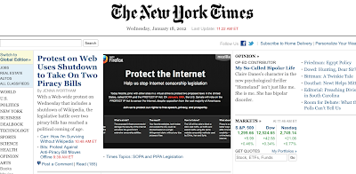
This morning my alarm went off at 4:30am so I could hop online to help launch Mozilla's anti-SOPA efforts. 

Although the scenarios are of different degrees of significance, I couldn't help but think of a story I once heard about how Steven Garrity, a long-time contributor, launched the original Firefox download page live for the first time early one morning from bed over 8 years ago. 

Once I finally made it into work it was a delight to see our main SOPA landing page on the cover of the New York Times amongst our peers at Wikipedia, Reddit, and more. 

There are many other bits and pieces to our SOPA campaign, but here is a overview of what we did on our main web facing properties. 

Site Blackout
We blacked out our main download landing pages by having them redirect to the SOPA landing page below (www.mozilla.org/sopa). 

That means that everyone wanting to download Firefox today or anyone who came to our main website through the normal front doors saw this page instead. Those numbers are well into the multi-million. We make the "deep" content available since we want people to be able to get support, and upgrade their browser for security reasons.

A few details:

- We launched using redirects that would not harm our SEO efforts by following guidelines from posts like this people put together exactly for this reason. 

-We also chose to keep a way for visitors to download Firefox - you can see it at the bottom of the screenshot above. This was a bit tricky since we didn't want to come across as "commercial" or trying to take advantage of this event to get more downloads but as Alex Fowler so aptly stated we give visitors the download option in order to: "...continue to support our mission, ensure users have access to support, as well as the ability to find and update to safer and securer versions of Firefox." 

Start Page Blackout
Even more significantly we dramatically changed the look and feel of our default "Start" page, meaning, the page you see when you type "about:home" into your browser. 

We made it black. We added relevant info.  We put a censorship slash through the fox. Everyone on the English build of the browser should see this page today if this is their default homepage. Those numbers are in the tens of millions. 


This launch with very Mozilla-esque  - willing participants huddling together in chaos trying to throw something together to make a difference for the future of the web. 

For example: here's the main etherpad we used to draft out our actions.  Nothing short of mayhem!

We'll see what results from these efforts as the day unfolds. 

In the mean-time it's been a very exciting day.

Monday, January 9, 2012

Different By Design


Firefox is a different type of browser. Mozilla is a different type of company. You can see that from our founding story, the way we work, our priorities, our non-profit status and more.

When it comes to marketing at Mozilla - which, hey remember how we're different? -  we call "Engagement" not "Marketing," we think long and hard about how to communicate this difference. 

After all, living and breathing an authentic story is the best way to spread the word about a product and our story is nothing but authentic.

These factors led to the launch of our recent brand campaign. Checkout this smattering of creative and notice its boldness, authenticity, and ability to set us apart from the crowd:

The Web Launch
When it comes to our main user-facing channel -- our website (one of the most viewed sites in the world) here's the creative we launched to get this message across:


And some localized versions... (finals are not this neon of a orange)


The "before" shot (Notice how we hint at, but don't really show our difference):
 
Here's What Happened
With the help of a simple survey we were able to measure the affect this new creative had on overall brand awareness. The shift was significant -- now the majority of all new Firefox users know Firefox is made by a non-profit. 

Before we launched this campaign the opposite was true. We crossed well over the 50% threshold and increased awareness over 20% all without hurting download conversion rate.

Next Steps & Bottom Line
We will continue to do more of this and will roll-out this campaign worldwide. And for now, we know we're on the right track and that aligning our outer 'presentation-layer' with our inner values helps us communicate what matters most to us in a way that resonates with our users.

Thursday, December 29, 2011

Mozilla IRC In Haiku Form


Mozilla IRC channels become a desolate place during the holidays; much like the deserted school hallways during winter break. Since I'm working remotely this week I poked around my usual channels to see what folks were up to and came across some interesting exchanges that struck me as worth recording in haiku form.

In their own ways these give a little taste of the ridiculousness, the challenges, the fun, the poetry that can be made of the everyday exchanges within the annals of Mozilla IRC.

Enjoy.


I have been thinking

i have been thinking
of contributing but i've
no clue where to start
   - #WebDev


about:memory

900 tabs! what's
about:memory look like
with that many tabs?
-#FX-Team

" ÷ <--- "

Bumped keyboard ends up
Making a division sign
It was Fligtar. heh.
-#AMO

New Year's Plans

have plans for new years?
Sadly not. I'll probably
be doing homework...
-#Spinzone

Stephen Donner

at the brainstorming
stage right now, but would love to
make this thing happen.
-#QA
I hope you enjoyed. Bonus: submit your own Haiku in the comments! 5-7-5 is all you need to know.
PS: There's a special haiku hiding-out in the stub-installer project we're working on scribed by the amazing, "Happiest Man Alive", Matej Novak, who I hope doesn't mind me posting it here:
Proudly non-profit
Free to innovate for you
And a better Web
 Happy New Year!